Procedural Toolbox
Creation and Completion of a Line Graph
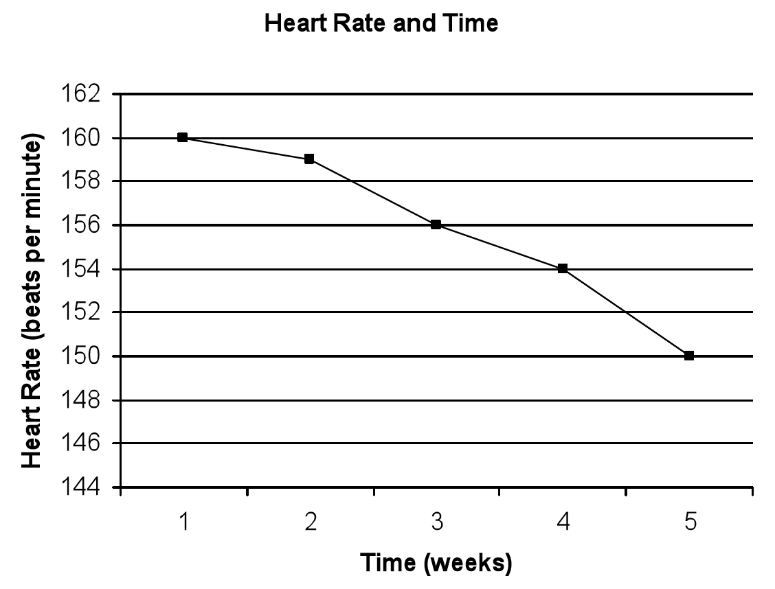
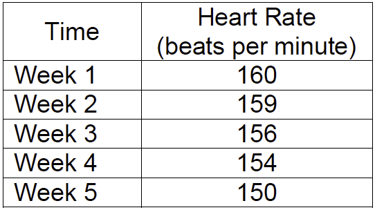
Maria wanted to determine how heart rate varies with exercise over time. She decided to jump rope for two minutes three times a week for five weeks. At the end of each week, she took her heart rate after she exercised and recorded it in the chart.
1. Draw an x-axis and a y-axis.
2. Evaluate your data. Determine which variable you will plot along the x-axis and which variable you will plot along the y-axis.
3. In experiments there is a variable changed by the person doing the experiment and a variable that is measured by the person doing the experiment. Typically scientists choose these two types of variables to graph. In the sample experiment, one variable is the time at which Maria took her heart rate. The other variable is her heart rate or the number of heartbeats she measured in a minute.
4. Typically, scientists place the variable they control on the x-axis. In the sample experiment, Maria decided to take her heart rate once each week. She determined when to take her heart rate; therefore, this is the variable she controlled.
5. Typically, scientists place the variable they measure on the y-axis. In the sample experiment, Maria measured her heart rate; therefore, heart rate is the variable she measured.
6. Label your axis accordingly. In the sample experiment, Maria placed time on the x-axis and heart rate on the y-axis.
7. Determine the beginning and ending numbers you will plot on the x-axis and y-axis. The beginning and ending numbers should be selected so that you can plot all of your points on the graph. In the sample graph, the scale along the x-axis is from 1 week to 5 weeks. The scale along the y-axis is from 144 beats per minute to 162 beats per minute
8. Determine the scale for each axis. A scale is the difference between numbers. For example, you may wish to include all numbers between your beginning and ending numbers. In the sample graph, all numbers between 1 and 5 are written on the x-axis. You could also create a scale that only uses some numbers that are multiples of each other. In the sample graph, the y-axis begins with 144 and ends with 162. However, only the numbers that are multiples of two are written on the graph.
9. Graph the data and connect the points with a line.
10. Maria’s graph would look similar to the following graph.