Procedural Toolbox
Drawing a Best Fit Line
1. Best fit lines are used to show the relationship between the two variables in your graph (x and y). They show how much one variable increases or decreases as the other variable increases or decreases. Once a best fit line is drawn, predictions can be made about additional x and y value points on the graph.
2. After plotting the data, use a metric ruler to draw a best fit line through the points on your graph. Most likely, this line will not connect each point.
3. The best fit line is a straight line that goes through the midpoint between all of the points. Move your ruler along the x-axis upward or downward to find the mid-point between all the data points.
4. Draw a line from the first data point to the last data point where the distance between the line and each data point is closest.
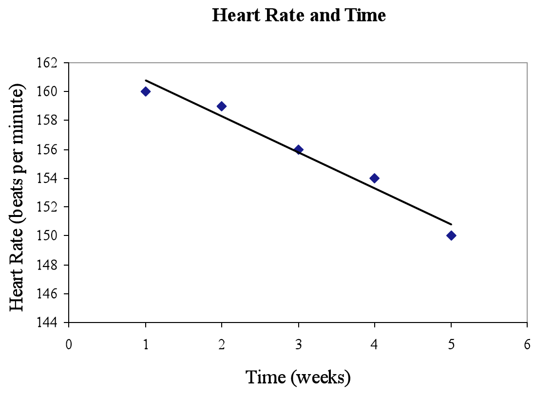
5. For example, after plotting the data below, a best fit line has been drawn.
6. To predict additional values, use the best fit line to estimate values between each data point that was graphed. Also, the best fit line can be extended to estimate values past both ends of the graphed data.