Bar Graphing with Google Sheets
1. If you haven’t already done so, download Graphical Analysis from the Vernier website or the appropriate web store:
• Windows and macOS computers—download from the Vernier website
• Chrome computing devices—download from the Chrome Web Store
• iOS and iPadOS devices—download from the App Store
• Android devices—download from Google Play
 Manual Data Entry and Graphing a Bar Chart in Google Sheets
You can use your Vernier Graphical Analysis app to graph any data you wish. The dMS (Digital Middle School) curriculum often requires students to graph data. If the graph is the result of data collected using a GoDirect sensor like the pH sensor, Force/Acceleration sensor, Temperature sensor, etc., the graph will automatically be generated as the data is collected.
However, sometimes students may need to digitally graph data to report to their teacher that results from other lab activities. In this case, we will use Google Sheets to quickly create a bar chart/graph of data.
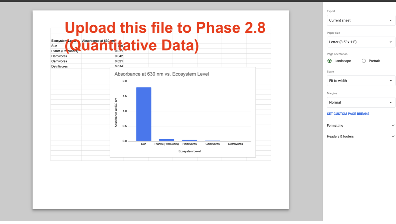
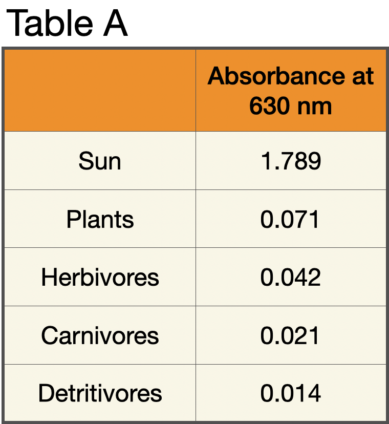
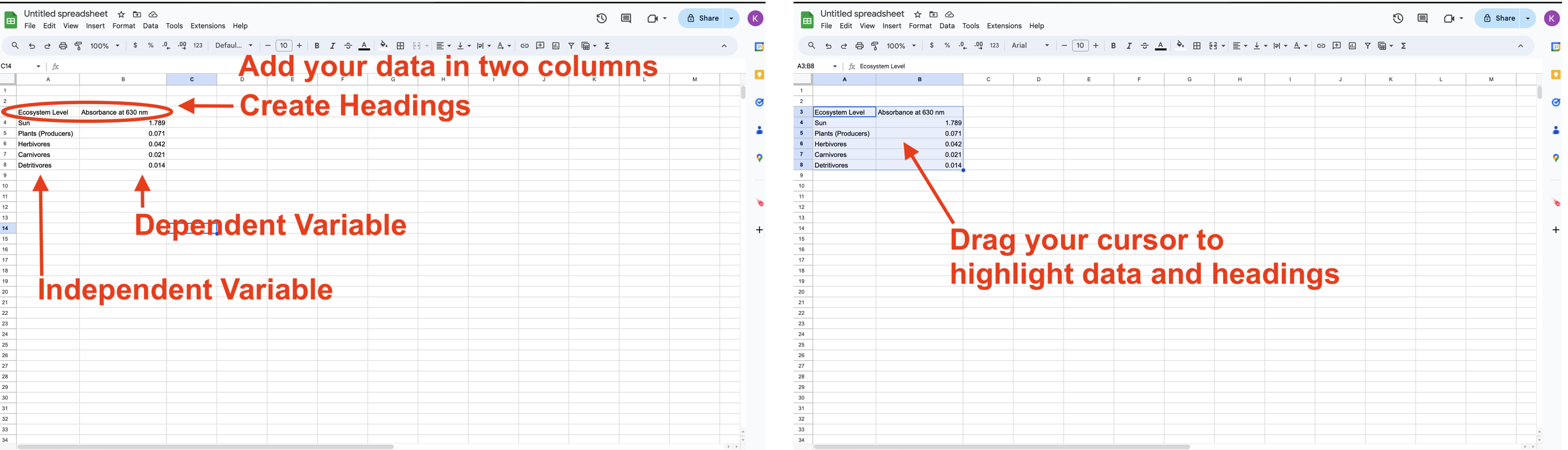
In the example used below, data similar to that collected in Ecosystems Investigation 1 will be used. Below is a simple Table (Table A) of the data analyzing the ecosystem level compared to the absorbance at 630 nm. Note that all of the images below can be clicked to enlarge.
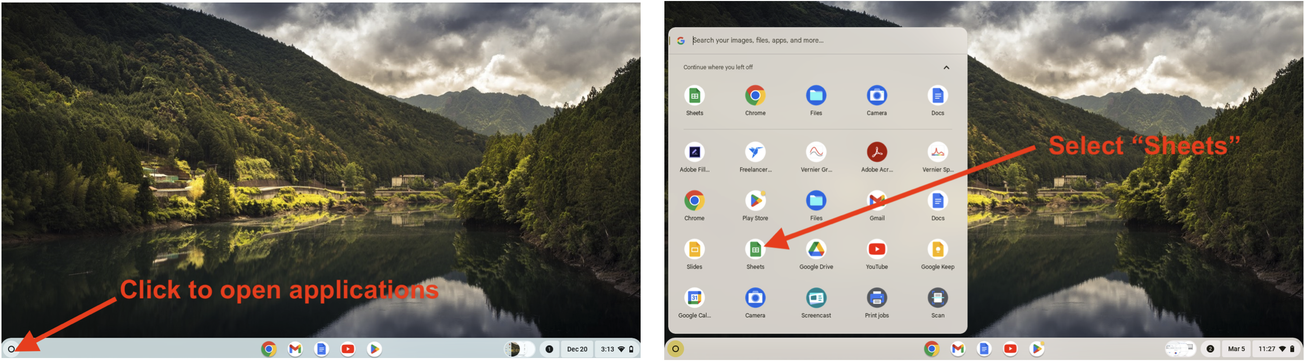
1. In Chromebook or laptop, open the Google Sheets application:
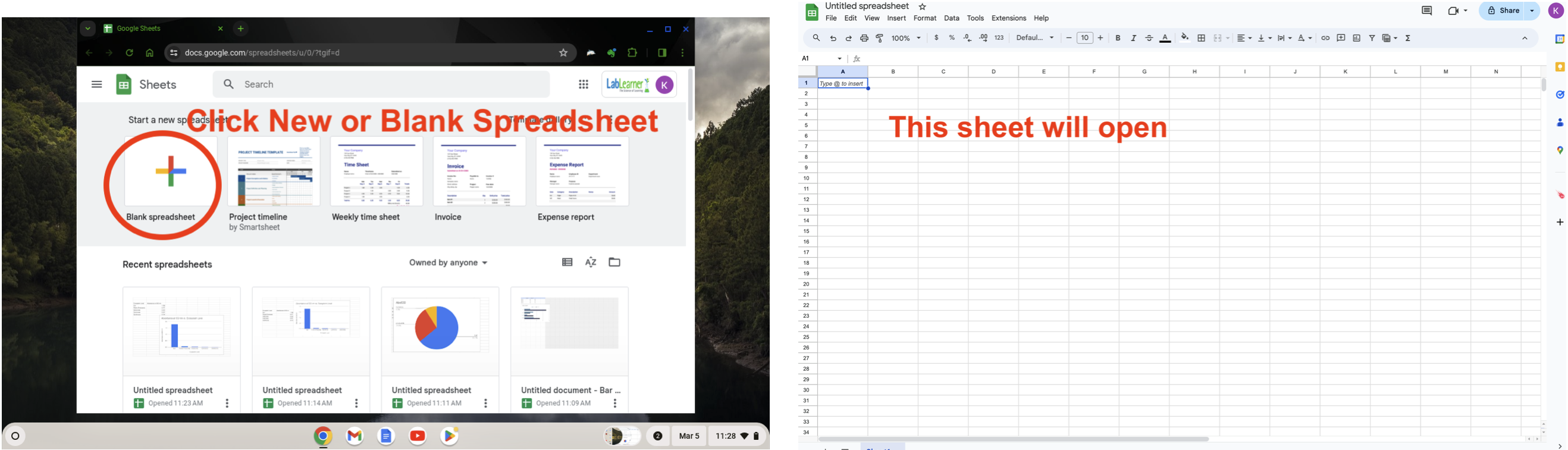
2. Create a new spreadsheet:
3. Enter your data and then use your cursor to highlight the data and headings:
4. In the top menu, click “Insert” and then select “Chart” from the dropdown menu. The data is typically presented as a line graph. If so, in the “Chart Editor” to the right.
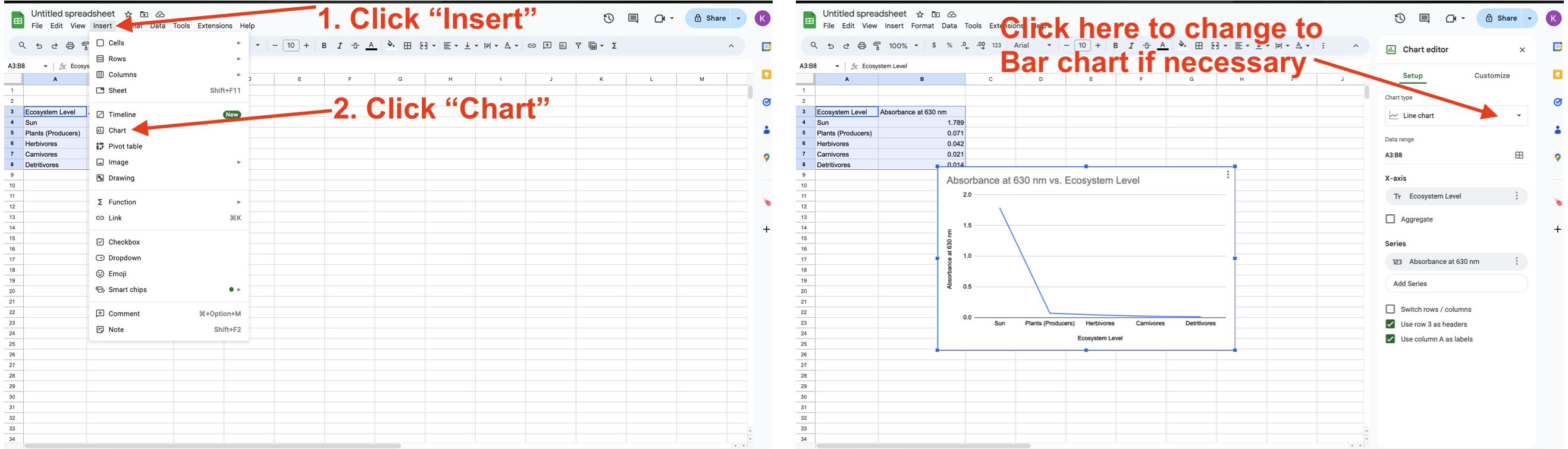
5. From the dropdown menu, select the Bar chart. Once your bar chart appears, follow the three steps shown on the window below to save and download your bar chart.
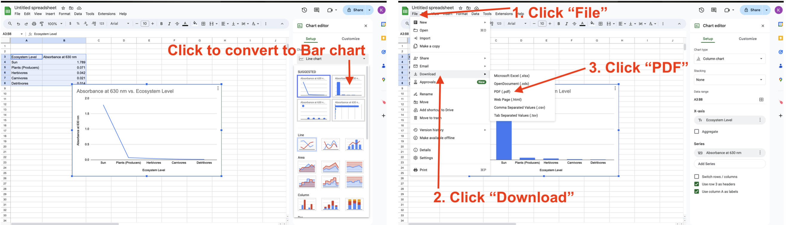
6. Finally, you can upload your saved PDF to your Student Guide in Phase 2.8 (Quantitative Data).