Teacher Portal
Science and Art
PostLab Slides 5
PostLab Slides 5
Science and Art

Science and Art
Investigation 5
PostLab Concept Slides


SLIDE VART5post-1
This was the fifth and final Investigation of the LabLearner CELL Science and Art. In it, students continued exploring perspective and the illusion of depth in paintings. In addition, they studied the use of color and color mixing in art.
______________________________________________

SLIDE VART5post-2
Use this slide to review the experiments students performed in Investigation 5 Lab.
Ask students to describe how they mixed the secondary colors purple, green, and orange. Students mixed equal parts of red and blue to make purple. The mixed equal parts of yellow and blue to make green, and finally, red and yellow to make orange.
______________________________________________

SLIDE VART5post-3
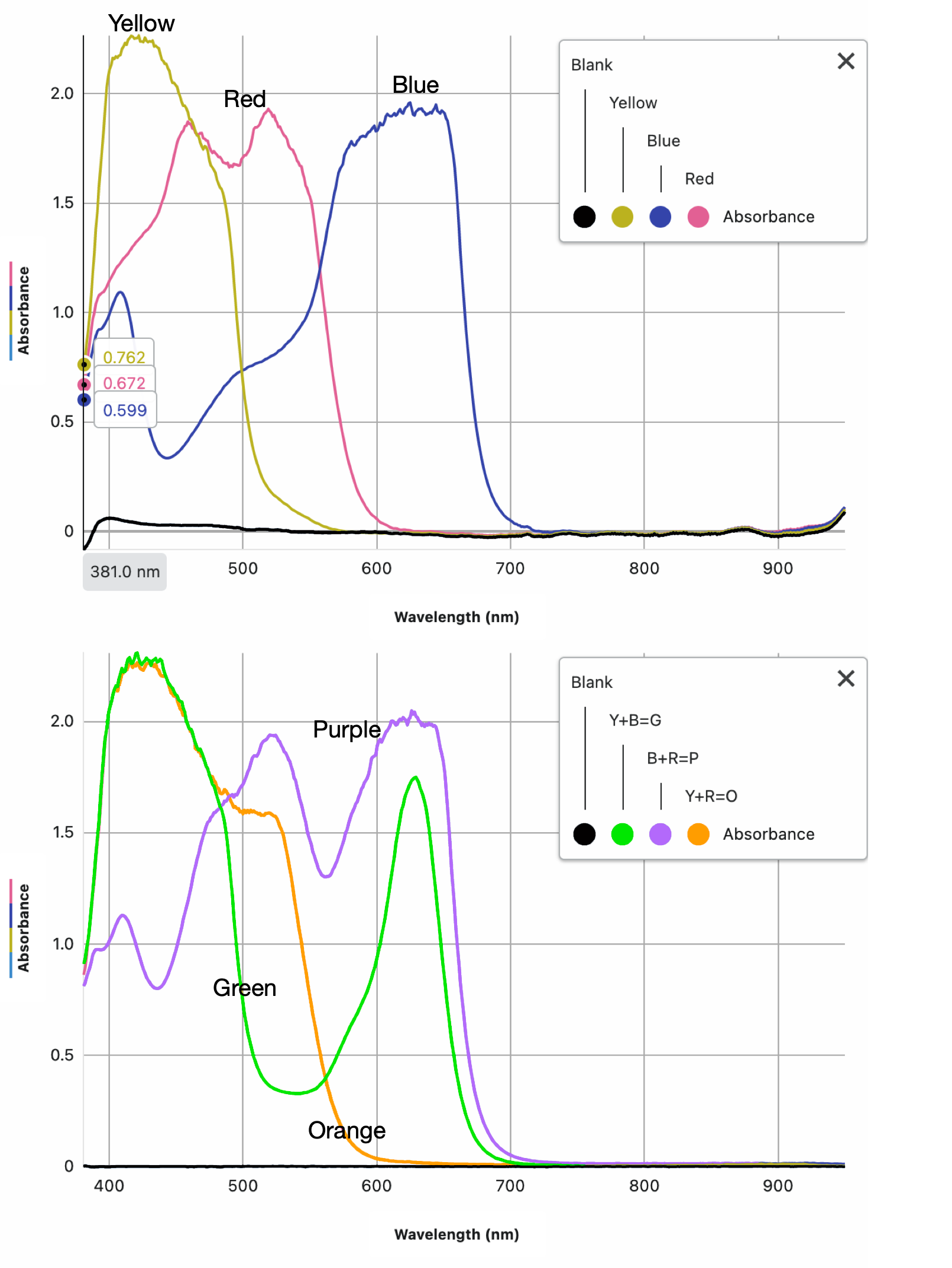
Use this slide to reinforce the concept that we only see colors (wavelengths), NOT ABSORBED by an object (a colored liquid in this experiment). That is, we only see wavelengths of light reflected from an object. If a certain wavelength(s) are not absorbed by an object, we will see that color when we look at the object. This concept is exceedingly important when interpreting the absorption spectra results.
The example on this slide is for the red sample. We see that most all other wavelengths of light (and their associated colors) are absorbed. However, in the range where we see the color red, there is very little absorption. Therefore, we see red.
______________________________________________

SLIDE VART5post-4
This slide can be used to review class results for Investigation 5 Lab. While the slide does not have the absorption spectra showing, the teacher may project the two following images as talking points when students review their own data as a class:
Three primary colors:

Three primary colors plus combined secondary color spectra:
Note: Student captured their secondary color spectra separately.
 Ask students to discuss the last two bullets on the right:
How are the spectra of the three secondary colors different from those of the primary colors? Student answers will vary. One thing is clear: the secondary spectra each have two peaks, while the primary color spectra have only one (although you see a slight dip in the red sample around 500 nm.
What conclusions might you draw from this analysis? Student answers will vary. However, it appears that the secondary color absorption spectra is a summation of the two primary colors it was mixed from. This would make sense since both original primary colors must be in the secondary sample. Therefore, in the primary color spectra, you see a red absorption peak around 500 to 500 nm and a blue peak of absorption 600 to 650 nm. When you then look at the purple spectra, you see both a peak at 500 to 550 nm (where the red sample peaked) and a second peak at 600 to 650 nm, where the blue sample peaked. This is what you might predict if both blue pigments and red pigments are in the purple sample.
The same situation exists for the green spectra. You can easily see the yellow peak at around 400 to 450 nm and the blue peak at 600 to 650 nm. Finally, the orange spectra show a yellow peak at 400 to 450 nm and a red peak at around 500 to 550 nm.
______________________________________________

SLIDE VART5post-5
As we come to the end of our discussion of color and color mixing in art, we need to discuss how technology is impacting art in our digital world.
On the left of this slide, we see an artist creating art with paints, canvas, and brush. On the right, we see a computer screen filled with visual graphics generated on a computer and viewed on a monitor. Today, much of the art we encounter was created on computers to be viewed on digital monitors.
On the left, the artist is mixing and applying paints using RYB colors (Red, Yellow, and Blue), as artists have done for centuries. Recall that you analyzed RYB (the primary colors) in the Investigation 5 Lab. Using RYB, you were able to mix the green, purple, and orange secondary colors.
Digital art and graphics do not use paints and pigments but rather pixels of light composed, once again, of three basic primary colors. However, in art created for digital monitors, the primary colors are Red, Green, and Blue and are referred to as RGB colors.
The next few slides are devoted to RGB colors and their use in digital art.
______________________________________________

SLIDE VART5post-6
This slide shows the RYG colors on the left and the RGB colors on the right. Notice that not only are the three primary colors different from the RYB, but the secondary colors (areas of color overlap of the three color circles) are also different.

______________________________________________

SLIDE VART5post-7
If you look closely at a color computer monitor or television screen, you will see that the entire screen is filled with tiny pixels. You are probably aware of how the number of pixels on a monitor describes its resolution. A basic display with Full HD 1080p resolution is referred to as 1920 x 1080. This indicates that there are 1920 pixels from left to right and 1080 pixels up and down. Therefore, such a display will have 2,073,600 pixels in total.
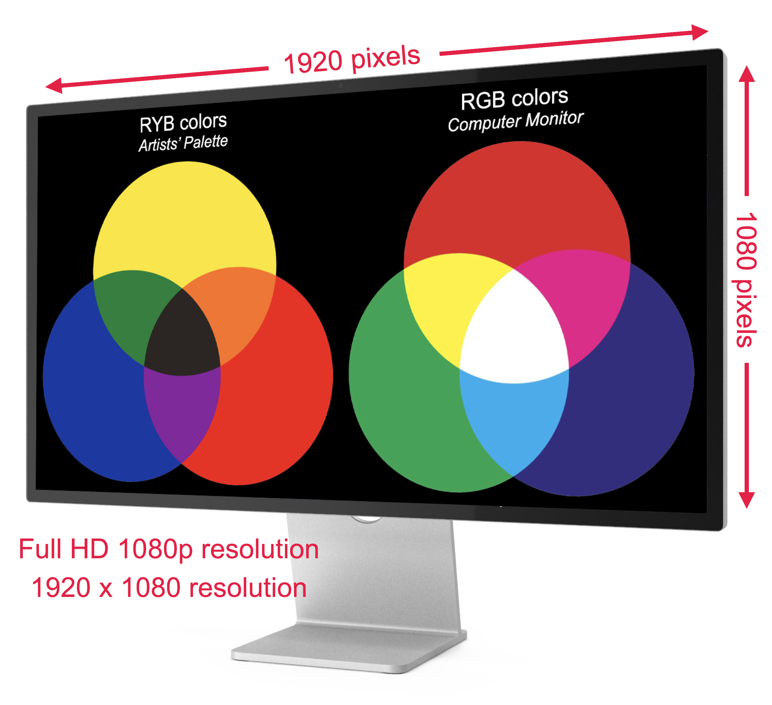
This slide also illustrates that each pixel on a display—all 2,073,600 of them—can contain the three RGB primary colors on a black background. The composition of the pixel determines how we see the color. If you look only at the three primary colors, you see that the pixels only contain that color. However, as you move into the secondary color, you see the each pixel has a combination of the three primary colors. Thus, for example, purple contains red and blue in each pixel, and yellow contains red and green, and so on.
Notice that when all three primary colors overlap, the screen displays white. We will return to this interesting fact in an upcoming slide.
______________________________________________

SLIDE VART5post-8
You can easily see the individual pixels, and if closely examined with a magnifying lens, you can even see the three primary colors each pixel contains. Use this or the previous slide to look at your own monitor with a hand lens and see for yourself. Be sure to examine the white overlap in the middle of the RGB colors. What primary RGB colors do you see in each pixel in a white area of the color scheme?
Students see green, blue, and red within each pixel when looking closely at a magnified white area.
______________________________________________

SLIDE VART5post-9
The curious observation that white areas on a computer display or television screen are created by pixels containing each of the three RGB primary colors makes sense based on what you will learn later in the LabLearner CELL Light. That is, white light is composed of all the other wavelengths of light combined.
This property of light is used in stage lighting all of the time. Stage lights are often a combination of separate red, green, and blue lamps focused to overlap on the stage.
On the left of this slide, the three colored lamps are directed straight down and do not overlap. Therefore, each light hits the stage as a primary color. However, if the three primaries are focused to overlap, a pleasing white light is created. Having each of the RGB colors present in each pixel on a computer display consequently produces areas of white. Again, you can prove this for yourself with a computer monitor or television screen and a hand lens.
______________________________________________

SLIDE VART5post-10
Based on the previous slides, you can see that today there is a new method of creating art that uses an alternative color scheme. Digital artwork is created and presented in the RGB format.
Traditionally, artists have used the RYB palette for centuries to create pictures, such as the one on the left by Claude Monet (Painting on a Houseboat, 1874). Of course, when you view this image on your computer display, you see it in RGB color format.
On the right of the slide, an artist is using a computer tablet and digital pen to produce a picture. Much of the graphics and artwork of the future will likely be created in this fashion. However, traditional RYB paints and canvas will also continue to be used as well.
Finally, the next three slides present images created by the new forms of art and graphics that brilliant and highly skilled artists of the past would never have dreamed of!
______________________________________________

SLIDE VART5post-11
This slide illustrates the detail and creativity possible with computer-generated art. Although created on a computer, the artist is nonetheless responsible for selecting (or imagining) the subject, the colors, composition balance, symmetry, depth, and all of the other aspects of any other work of art over the years. This picture, Evakuierte Zone, by the German digital artist Gerhard Mantz, was created in RGB colors and has been well-received internationally.
It remains to be seen where digital art will go with the advent of using artificial intelligence to create graphical works. In the case of AI, human decisions will be replaced by computer algorithms and programs. While humans will “instruct” AI and decide when and where to use it, graphical creations can be produced by individuals who do not have the skills and mindset we typically have ascribed to the artist. However, throughout art history, there have always been innovations that have changed the art world. The advent of oil paints, for example, greatly facilitated the realism that began to be associated with Renaissance art.
______________________________________________

SLIDE VART5post-12
The line between what is and what is not art is becoming increasingly blurred. This slide, for example, was created by processing a scanning electron microscope photograph (a micrograph). It shows the novel coronavirus that causes COVID-19 (colored purple in this rendering), infecting cultured kidney cells. The cells are packed to a point where they burst, spilling the virus particles to infect additional cells.
The micrograph is artificially colorized, as electron micrographs produce black-and-white images. Some individuals find this kind of graphic a genuine art form, and some truly breathtaking micrographs have served as the content of very popular international “art” exhibits.
This picture was taken by John Bernbaum, an electron microscopist with NIH’s (National Institutes of Health) National Institute of Allergy and Infectious Diseases (NIAID).
______________________________________________

SLIDE VART5post-13
This final slide is the polar opposite of the previous micrograph of the COVID-19 virus. While the processed scanning electron micrograph of COVID-19 (previous slide) represents incredibly small objects very close to us, the enhanced photographic image of the Pillars of Creation section of the Eagle Nebula shows an incredibly large structure extremely far from us.
This image was captured by the recently deployed orbiting James Webb Space Telescope. The pillars are located 6,500 light-years from Earth. That is, light leaving the nebula today will not reach Earth for 6,500 years! If it disappeared tomorrow, we would not observe its disappearance for 6,500 years. The Pillars of Creation are 6.1459 x 10¹⁶ km (3.8211 x 10¹⁶ miles) from Earth.
One can surely appreciate the beauty of such astronomical images, and exhibitions of similar images of outer space are not uncommon. Is it art? What do you think?
______________________________________________